The previous branding of Beggar’s Banquet lacked a unified design and a distinct character. Instead of a consistent logo, they used multiple variations. Additionally, there was no defined color palette or imagery.
We rebranded Beggar’s Banquet because of the endless possibilities. To go back to an old-school elegant look while keeping the look updated. Our main goal was to involve the dragon they had in their restaurant. Using the dragon as our main goal we were able to create unified systems.
Old Logo - Fonts & Color
New System
New Fonts
Color Pallet
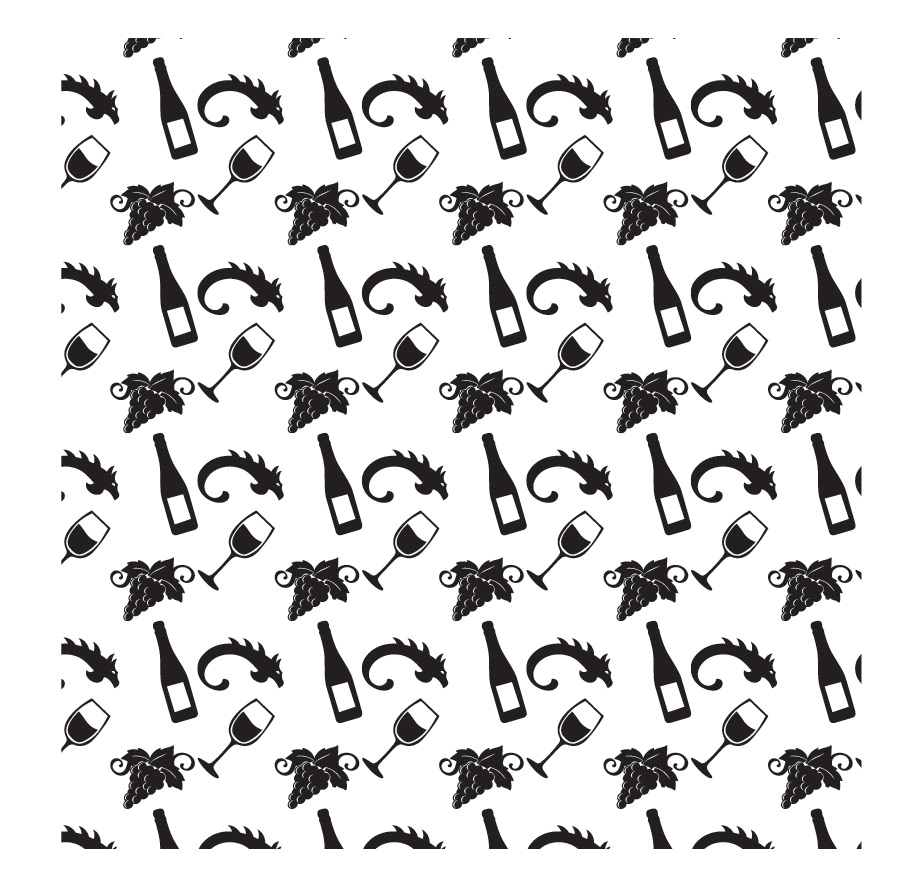
Icons and Patterns


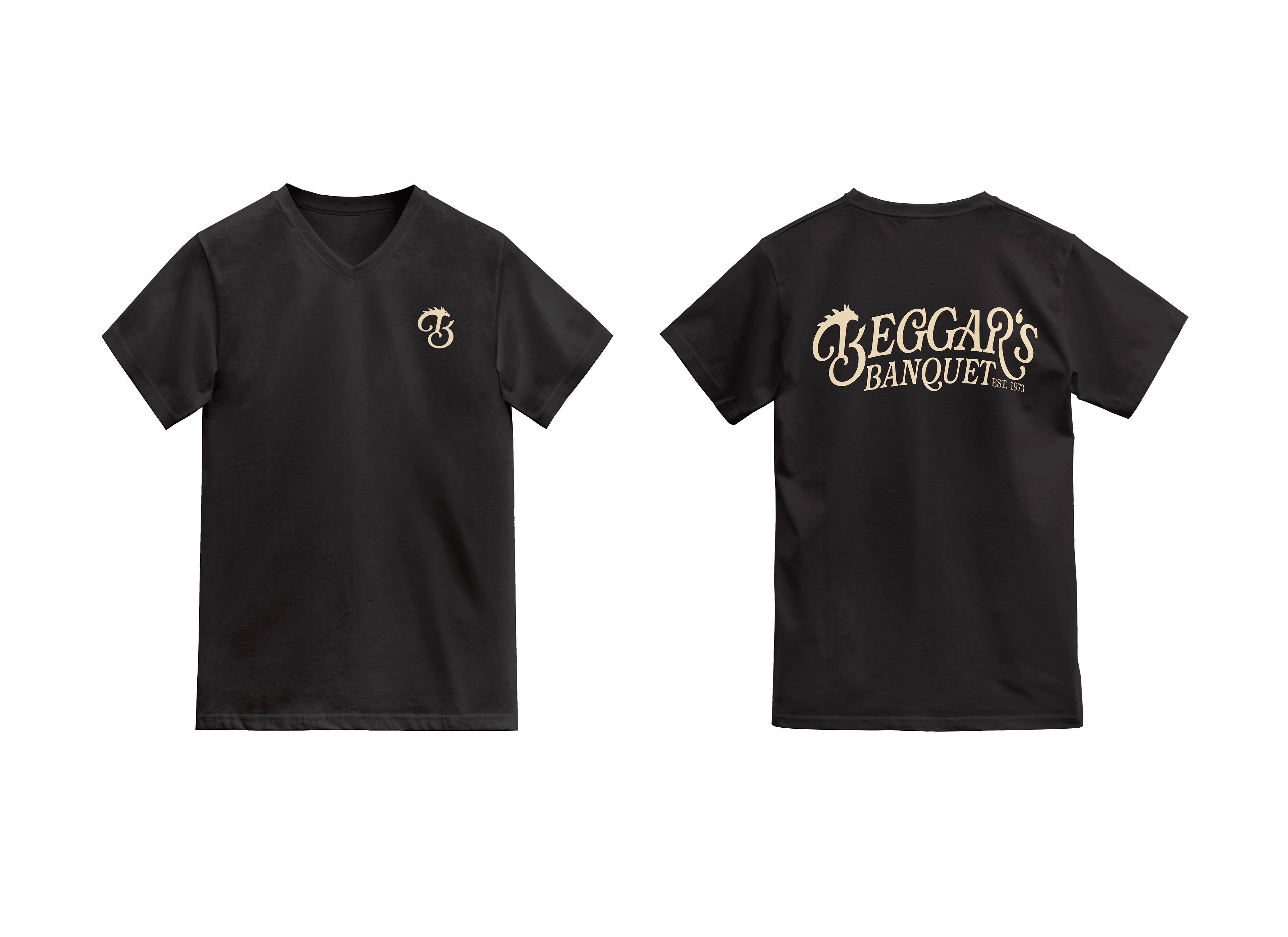
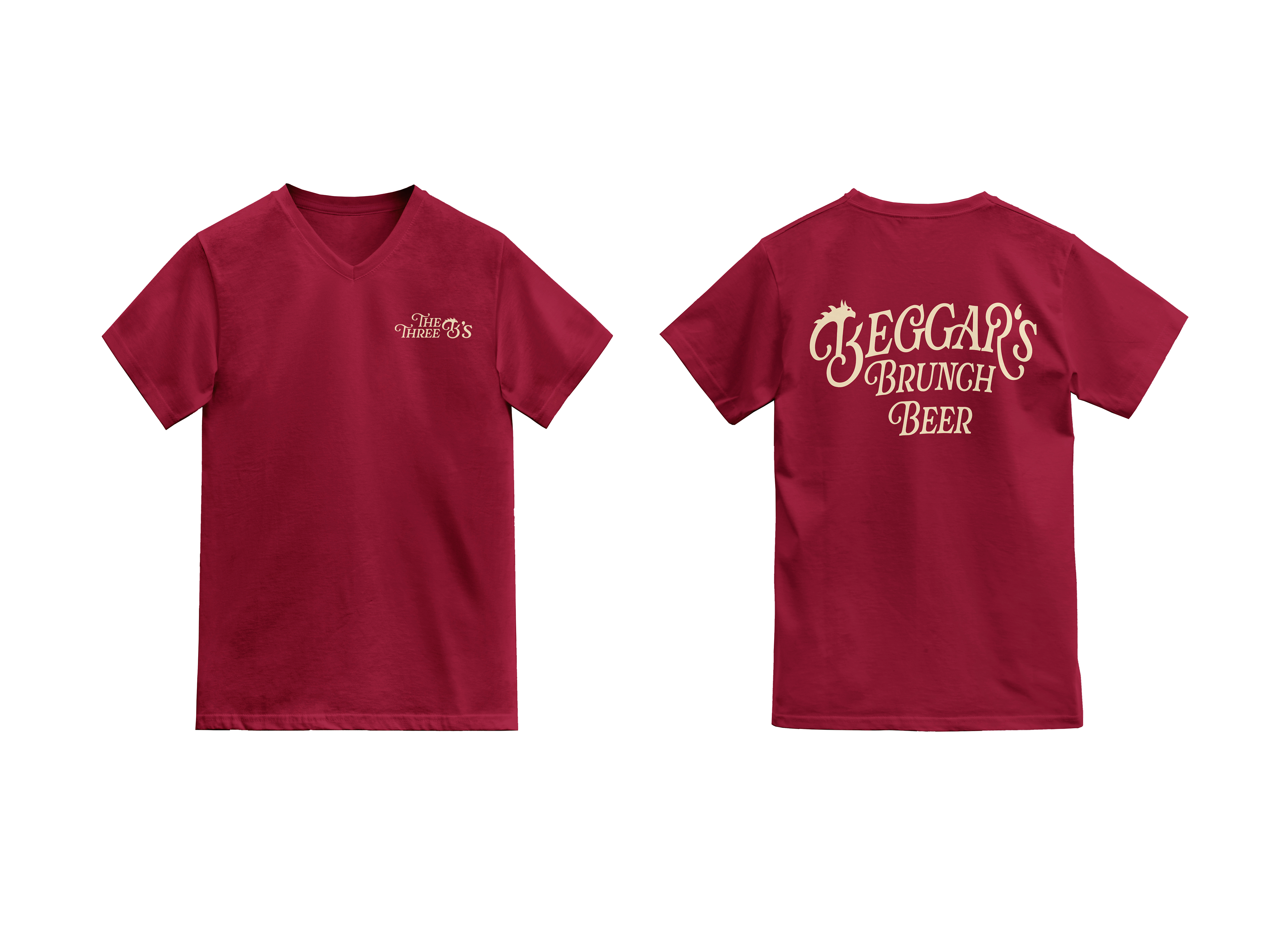
Mockups
